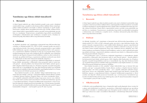
Because of a response I got to my post about using MS Word templates with LaTeX, documenting the way I've been generating presentation material for my talks since 2010 got its priority raised. Like I said in the aforementioned post, I prefer using LaTeX for typesetting, and it's the same for creating those frames that appear behind my back during talks.
For the first few talks, I used the default template, then I switched to the
Warsaw theme, which I frequently encounter in the beamer-using subset of IT
security presenters. In 2011, Lasky – the graphics genius around Silent
Signal – designed a presentation template that I actually liked, so I started
fiddling with beamer to adapt the new theme.
First, I created a file called s2beamer.sty with the usual header, and two
lines that set a sensible base. I had to disable shadow, since it couldn't
handle setting background images, as it assumed that the background was a
solid color.
\ProvidesPackage{s2beamer}

\useinnertheme[shadow=false]{rounded}
\usecolortheme{whale}
The theme I used included a separate background image for the title
slide, and another for the rest (the ones with actual content), so I defined
a command to create a title slide, which sets the background before and after
the first frame. I added newlines only for readability, they must be removed
or commented in the .sty file.
\newcommand{\titleframe}{
    \usebackgroundtemplate{
        \includegraphics[width=\paperwidth,height=\paperheight]
            {img/titlebg.jpg}
    }
    \frame{\titlepage}
    \usebackgroundtemplate{
        \includegraphics[width=\paperwidth,height=\paperheight]
            {img/slidebg.jpg}
    }
}
After setting the background, the colors needed to be changed too. First, I set the color of the body text and structural elements (such as list bullets). The color of the frame titles was set to the same orangeish one.
\setbeamercolor{normal text}{fg=white}
\usecolortheme[RGB={239,73,35}]{structure}
\setbeamercolor{frametitle}{fg=structure, bg=}
The default list bullets are actual bullets, which looked bad on the background image, so I changed them to little arrows. Also, I hid the navigation controls (placed in the lower-right corner) since they conflicted with the footer of the theme, and most people doesn't even know what they're for.
\setbeamertemplate{items}[default]
\setbeamertemplate{navigation symbols}{}
URLs and code snippets are written using fixed-size fonts (as they should be), but I prefer using Inconsolata for this purpose, instead of the default.
\RequirePackage{inconsolata}
In case of code snippets, I prefer using the listings package, and I configured it to use such colors for syntax highlighting that go well with the theme (newline added in case of the last line for readability only).
\RequirePackage{listings}
\definecolor{s2}{RGB}{240, 56, 31}
\definecolor{s2y}{RGB}{255, 200, 143}
\lstset{basicstyle=\footnotesize\ttfamily, breaklines=true,
    tabsize=2, keywordstyle=\color{s2}, stringstyle=\color{s2y}}
Since I give talks both in English and Hungarian, I added the following
expression to set the order of first and last name according to babel
language set by the document. (The \hunnexlabel command is defined when
the babel language is set to magyar.) It also turns the e-mail address
into a hyperlink that launches the default e-mail client when clicked on.
\ifdefined\hunnewlabel
    \renewcommand{\name}{\lastname\ \firstname}
\else
    \renewcommand{\name}{\firstname\ \lastname}
\fi

\author{\name\\\texttt{\href{mailto:\email}{\email}}}
The above lines require the following commands in the document:
\renewcommand{\email}{vsza@silentsignal.hu}
\renewcommand{\firstname}{András}
\renewcommand{\lastname}{Veres-Szentkirályi}
With these all set, I can create presentation material that look awesome but are still generated from plain text, thus compatible with all sensible editors and SCMs. You can see the snippets above in action by taking a look at my Hacktivity 2012 slides (four of them are below this paragraph), and some of them in the ones I made for Hacktivity 2011.

